
A couple weeks ago I went to a meeting of my local WordPress (support) group and one of the talks was on upcoming web trends that we needed to pay attention to. Oh boy, my head was swimming in a matter of minutes. Here are the bullet points to the talk:
- WP Trends 2014:
- Flat Design a la iOS 7
- HTML5 video
- Show AND Tell (visual emphasis)
- Long Scroll/Single Page sites – infographic design.. more likely to scroll than click to link
- “Above the Fold” has lost some meaning – angry bear long scroll graphics heavy…
- Heros In, Sliders Out – large big image, little text, call to action.
- So Long Sidebars … [sad trombone]
- Websites as Apps – apppresser, … plugins to wrap websites as apps, mostly for mobile devices… Pocket.app..
- Tools to preview website on every possible configuration, especially mobile. No free app known.
Many if not most of the designers in the room seem to use their sites to promote their product or service. I felt like I was the only one working from a more traditional, blogging or journaling background. But thinking about the talk really made sense to me as far as what the reader encounters upon first coming to your site and whether the reader stays or moves on.
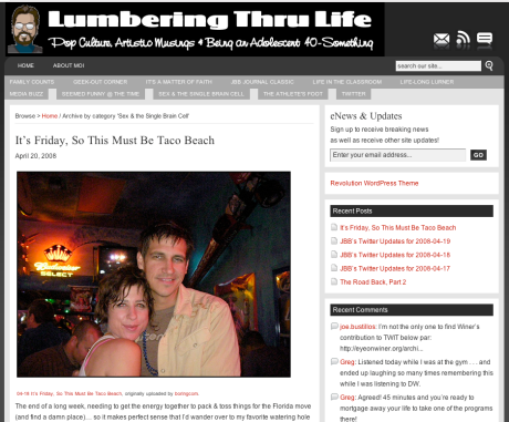
Revolution magazine theme – image by Joe Bustillos
Coming from the old days when blogs where long if not endless pages of text that required endless scrolling to navigate, I thought moving to a more magazine like front page where the reader was greeted by six or more article snippets with strong visual support would be the thing. In part this layout mimicked a glossy magazine/newspaper layout. Now it seems that there are at least two problems with this assumption. The first was that readers mostly came to blog posts from links on social networks and never really see the front page. So what they see of the blog isn’t the newspaper/magazine layout, but the single post. The next problem is that, unlike a newspaper, one could not read the whole article from the front page but had to click on the article to get beyond the first sentence. And folks don’t want to click, but would rather see the whole thing upfront. So, despite all of my efforts to create a magazine-like experience the only ones who might have cared about my front page design might have been other bloggers looking for cool front page designs and not my intended audience.
Funny thing was that over a year ago I experimented with an extreme minimal theme called Minimatica that only presented part of the featured image of the most recent four articles. I thought this design would help force me to keep working on my posts because otherwise the front page would be stuck with the same four images. But even then I was thinking that most of my visitors were coming from links posted in Facebook or Google+ and weren’t seeing my front page at all. Then after cutting back on my blogging due to my illness, I switched to a featured-image-slider theme because it was always automatically refreshing to the most recent six posts and thus seemed more visually appealing.
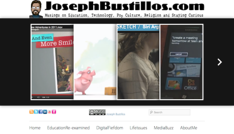
Minimatica WordPress theme – image by Joe Bustillos
So my take away from the talk, for me is that my front page should look like a single post page with the whole single article posted, supported by a strong image on top and no distractions or sidebars on either side of the article. And at the bottom should be whatever “call to action” one is helping to create with the article, including where to click next. It should be the same experience whether one came to the blog via a link to the specific article or is just typing in the blog URL. Simple. Direct. Visual.
Alas, the really sad part is that I know now that I get far more readership from readers who read my articles that I post completely on my Facebook page than ever click the link to my blog. That wouldn’t necessarily be so bad except that Facebook and Google+ posts are limited to a single associated image and my articles frequently require multiple images and embedded videos. They just look better on my blog than on either Facebook or Google+, but the audience is still more on Facebook than directly view my work in my blog. I need to work on developing a stronger audience directly coming to my blog. Ack.
—==+==—
So… having begun this post, I knew that I would then need to find a theme that would enable me to experiment with these minimalistic-visual-no_clicks-scrolling blogging ideas. Adding to the challenge was that in the past year I’ve moved from a self-hosted WordPress.org site to a WordPress.com site, which greatly limited the themes that I could use and I also wanted to do this without purchasing the theme… Thus, it’s taken me about two-days of searching and experimenting to pick a Tumblr-esque theme, writr, that is visual and features the latest article with minimal distractions. Whether one comes to the blog via the front page or through a link to the article directly from a social network the experience will be the same, with the article completely laid out, and no-clicking to continue. We’ll see how this works out. Any thoughts on this new look/theme is welcomed in the comments below…
Resources:
- Featured Image: Bloggeur deux
 Some rights reserved by Mike Licht, NotionsCapital.com, http://www.flickr.com/photos/notionscapital/2259052631/
 - WordPress Orlando Meetup
- Revolution WordPress Theme
- WordPress Theme To the Rescue: Minimatica 1.0.8 by One Designs
- minimatica WordPress Theme
- writr WordPress Theme


It is encouraging to know that you are working so diligently to produce a blog that is enjoyable and easy for your readers to use. The seemingly endles hours put into this process is appreciated by your readership and shows a true committment on your part. Please, keep up the good work
the blogging world needs more writers like you.
Thanks for the kind words, my friend. I hope that these days finding you spending your energy on constructive/creative endeavors. Thanks again.